Showing posts with label art. Show all posts

Friday, April 3, 2015

he called the buildings "cold-hearted", "inhuman", "hideous", and "monstrous".

barbara langendijk afw 2015 were simple, clean japanese-inspired clothes using sheer, knit, leather, and pvc(?) whose forms could be changed by the wearer with the use of clips and draping. normally blank white lines and anything this winter-ish or minimalist would remind me of modernism because it's where form is completely dependent on function (in minimalist clothing and in the need to stay warm during winter). but, there was a harshness in these clothes that reminded me a lot of the cement, abstract structures of brutalist architecture, which i'm trying to finish obsessing over before spring comes and i need to move on to something softer. 


the shape of this is absolutely !!


the layering and what looks like fraying of the material on the side are cool


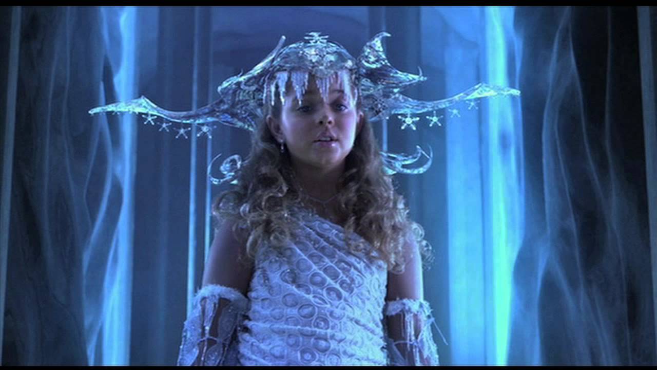
not sure why, maybe it's the fluffiness that looks like snow, but this reminds me a  bit of the ice princess from sharkboy and lavagirl


the clips are amazing, my only wish is that they were made of cement (who knows how practical that would be though), to fit in more with the brutalism. 


these pants


incredible fabrics; this is an example of where the clips really create an entirely new garment from the same piece. also-- there's also an incredible number of brutalist post-offices.


the bottom looks a bit like paper which is cool, and the double turtleneck, and the slouching sleeves


contrast and layering

and some more architecture that i didn't pair with clothing: 

isn't this the most beautiful theater you've ever seen:, it kind of looks like an abandoned power plant:


 this photo is a part of frederic chaubin's cosmic communist constructions photographed-- a book of 90 buildings built right before the collapse of the USSR that showcase the weird, emotive, and honest architecture of that time. 


one of the criticisms of brutalist architecture that i actually find to be one of the most beautiful things about it is the way that rust and water stains take over the structures when they're exposed to the climate of the countries where they first became popular.

i've only recently gotten super interested in architecture thanks to my english teacher who loves it, and i'm finding it to be really interesting. one of my favorite things that i talked about a little before is the correlation between the design of a building and its use; it would be strange to have a business in a little victorian house. i also love how evocative architecture can be for something made of metal and steel and concrete. what are your opinions on it, and also on the clothes in this collection?
-=-
kanyinsola
//
- the title is an anthony daniels quote from here about why he hates brutalist architecture (lol)
- all photos of the lookbook or the show are from here
- the photos of architecture are:
1/14/15(fyodor dostoevsky theater) via | 2 (carpark in hanover, germany) via | 3/8/ 16 (from cosmic communist constructions photographed) via | 4 (d.b. weldon library) via | 5 (pilgrimage church) via | 6 (preston bus station) via | 7 (habitat 67) via |  9/13 via | 10 (preston bus station) via | 11 (university of leeds) via | 12/17/18/19 via

Friday, November 28, 2014

you found the sweater on the ocean floor

i used lyrics from cousins by vw for my title because i feel like the fast-pace of the song reflects the recent jump in my productivity haha.

so... i thought it would be cool if i gave you guys an update on the art stuff i've been doing in the past few months and then you gave me some feedback on what you thought of it because that's what the internet is for??? aside from cats obviously.

over the summer i decided to submit some of my writing to a few zines:


in girls get busy zine issue #22 here


 in cherry zine issue #5 here (you might have to open it up in a new link to read it bc it's so blurry from the file format. and if you really want to read it- it's on page 47 of the zine.)


i don't love the photos i took to accompany this poem and i really just took them to test myself and see if i could do it but i am really happy they got published:


in lozenge mag issue #3 here

i strongly recommend reading through these zines because they are full of creative, intelligent, super cool people. 

all the writing i did above feels really 7th grade to me (because technically i was still in 7th grade when i wrote them) but it's kind of hard to look at it objectively when it's basically a part of you- so i'd really love to hear what you think about it.
--
the next two things also happened over the summer and were weird for me because i kind of assumed i would only ever be good at writing so i was really wary of trying out different things- and i was just doing it as a sort of experiment. 


photo of some tennis courts in the suburbs that turned out kind of cool


made using ms paint 

my favorite thing about all of those is the color: the blue and weird shade of red in the first, and then the gradient in the second one. it was v cool to see that other people enjoyed it and reblogged it and stuff 

then these are some of my more recent entries from my new journal- i kind of like that they have no specified theme, unlike the things i used to make, because it gives you a lot more freedom. also they're kind of a shift from my old busier collage stuff and i'm really liking it even though it all looks/feels to me, kind of rough and hurried and i'm pretty sure i've spilled coffee on everything:


v quik sketch


playbill from a show about rob rauschenberg that i saw with my friend. i loved the play because it was set in 1930s america, and they passed out food from that era (kool aid, processed cheese slices, pizza, candy) to kind of make us feel like we were in that era and it was really cool.


attempting to collage again

-


(sweater / marshall's)

i'm taking a fashion class at school this year and i made this skirt for my first show (i feel pretentious and weird saying that but whatever). the skirt looks a little weird on me because i took this photo in a rush so i didn't put it on correctly and it's also kind of wrinkled. (if it's not clear, the thing at the bottom is like a slit/flap).

my favorite thing about the skirt is probably the fabric which is blue-green with multicolored thread running through it:


 the fact that sharing art feels like both narcissism because "LOOK AT ME I MADE SOMETHING" but also full of self doubt because "omg is anyone going to ever like this thing i made?" is probably what scares me most about it. what do you guys think about all of the art? Also, if you wanna, you can link to some of YOUR stuff in the comments because i love reading/seeing what you smart, creative people have to say!

lastly:

i'm super excited to say that i'm a staff writer for a really cool magazine called speak easy- we're launching december 1st- and you should follow us on instagram (@speakeasyzine) for more updates, in addition to submitting: (speakeasymag@yahoo.com)!


-=- 
kanyinsola 

ps-  sorry for saying "really cool" 30 times <3

Thursday, April 17, 2014

in a dream you saw a way to survive and you were full of joy

  
Recently I've been experimenting with different mediums. This collage was made  on MS Paint using photos from Tumblr, a Jenny Holzer quote, and screenshots from Submarine- which I was watching while working. 


Submarine was beautifully written and directed and was almost an endless stream of lovely sea-side shots and Alex Turner's voice. It's one of those films that are kind of like  Wes Anderson movies because they have a  self-defined genre (does that make any sense at all?) I just mean the films are so original that they don't really fall under any pre-existing set of film standards, they just create their own. guhh I'm sorry- words are very confusing. But the movie is rated R (for sexual stuff and profanity) so keep that in mind . 


 screencaps from my tumblr when I thought it nicely represented my thoughts/vibes.

themes:
pastel
blue
water/ocean
plants
light
unrest
survival
dark green

vibes:
Submarine
Blue is the Warmest Color
greenhouses
overrun gardens
King Krule 
Picasso's blue period
Unknown Pleasures by Joy Division


I did these designs a few days ago; hopefully I'll be able to take a fashion class next year and these designs will end up somewhere other than the back of m
y closet. I'm extremely confident that I'm going to look back on this in a week and want to destroy it anyway so..? I feel a little weird because the designs are a little too simple for clothes I could actually see myself wearing, but maybe it's because I was drawing with the fact that I have no sewing experience on my mind.


gif of my thoughts throughout the designing process


Journal page feat. badly-drawn little collage-comic


blue sketches

I'm not really sure if I like any of my art/writing or if I'm just disillusioned that it's good until I create something better- at which point I'll realize how terrible it is. Maybe that's just a sign that my art is slowly getting better- which is good. 

I don't know, what do you think? Do you have any advice for artist's block or whatever it's called when you hate everything you make?

--
kanyinsola
--


Saturday, April 5, 2014

i'm not being funny, i don't know how to be- it's unfashionable and that's not me


1// Sunnysprinkled by Elise Mesner


2//Sequence by Tyeb Mehta 


3//Girls Of Blaze by Solange x Puma


4// unknown via tumblr


5// yasmine ines (bloodandconfetti) on flickr

Forty Nine People&#8217;s Meditation, 2004, Ahn, Chang Hong

6//Forty Nine People's Meditation by Ahn, Chang Hong


7// BFA work by Jennifer Mehigan 


8// Still Lives- Olympics by Richie Talboy 

new work, 2013 - the first image of a project I&#8217;ll be working on this winter

9// Still life, 2013 by Laurence Philomne

10// Fever Girl by FEMME 


Lately I've been feeling a little stifled by my daily schedule (of waking up; going to school, extracurriculars; homework; sleep; repeat)and afraid of falling into a pattern of wasting my life doing things and talking to people that don't make me feel good instead of things like making art and watching plays. 

I'm a little torn between wanting a routine that continues in perpetuity-because I get really anxious when things don't go according to plan- and wanting everything to be a continuous stream of impulsive decisions that lead to me meeting people who change my life . So now I'm working on finding a balance of that while making sure that my consciousness doesn't pass me by.

So I guess that's all making me attracted to the types of photos and music that display routine objects and events against bright backdrops: the art highlights their unimportance so much that they actually become important - and never really have the fear of fading into monotony.

ETA: This actually reminds me of the Rene Magritte quote about 
"making everyday objects shriek aloud"
(I tried hard to find a way to put that in there without sounding snobbyartkid)

themes

pink/blue
beauty rituals
subdued vs bright

What do you guys think: which photos are your favorite, and if you listened to the FEMME song- let me know what you think of it. 

--
kanyinsola
--